Hello! I’m Liesel, a Sydney-based
graphic designer, illustrator
and consultant.
Work
Illustration
About Me
Get in Contact
︎ liesel.schwinghamer@gmail.com
︎ @lieselsc_
︎ Liesel Schwinghamer
︎ Material Experimentation
Experimenting with the intersection of handmade and digital materiality was one of the key things I wanted to explore, and so I wanted to stay open to choosing materials used which worked best for each story. I kept in mind that since drought was a central theme of my project, playing with materials which communicated dryness would be important.
I began my materiality experiments with riso animation, as I was inspired by its ability to imbue footage or landscapes with shifting, uncertain or nostalgic tones. I initially designed my first story with this in mind, but decided that this would be too complex, expensive and overall there would be other ways which I could communicate this tone.
I began my materiality experiments with riso animation, as I was inspired by its ability to imbue footage or landscapes with shifting, uncertain or nostalgic tones. I initially designed my first story with this in mind, but decided that this would be too complex, expensive and overall there would be other ways which I could communicate this tone.

I then experimented with pencil rotoscoping to get across similar shifting, uncertain tone and fluidity to my animations of familiar scenes, while allowing me to achieve smooth transitions in the looping animations. As I continued making animations, I found I was more able to lean into the dryness of the pencil to speak to the drought. For the final printed illustrations, as viewed without AR, I wanted to focus on simple, high-contrast images which still communicated dryness and handmadeness, and so these were drawn in wax crayon.

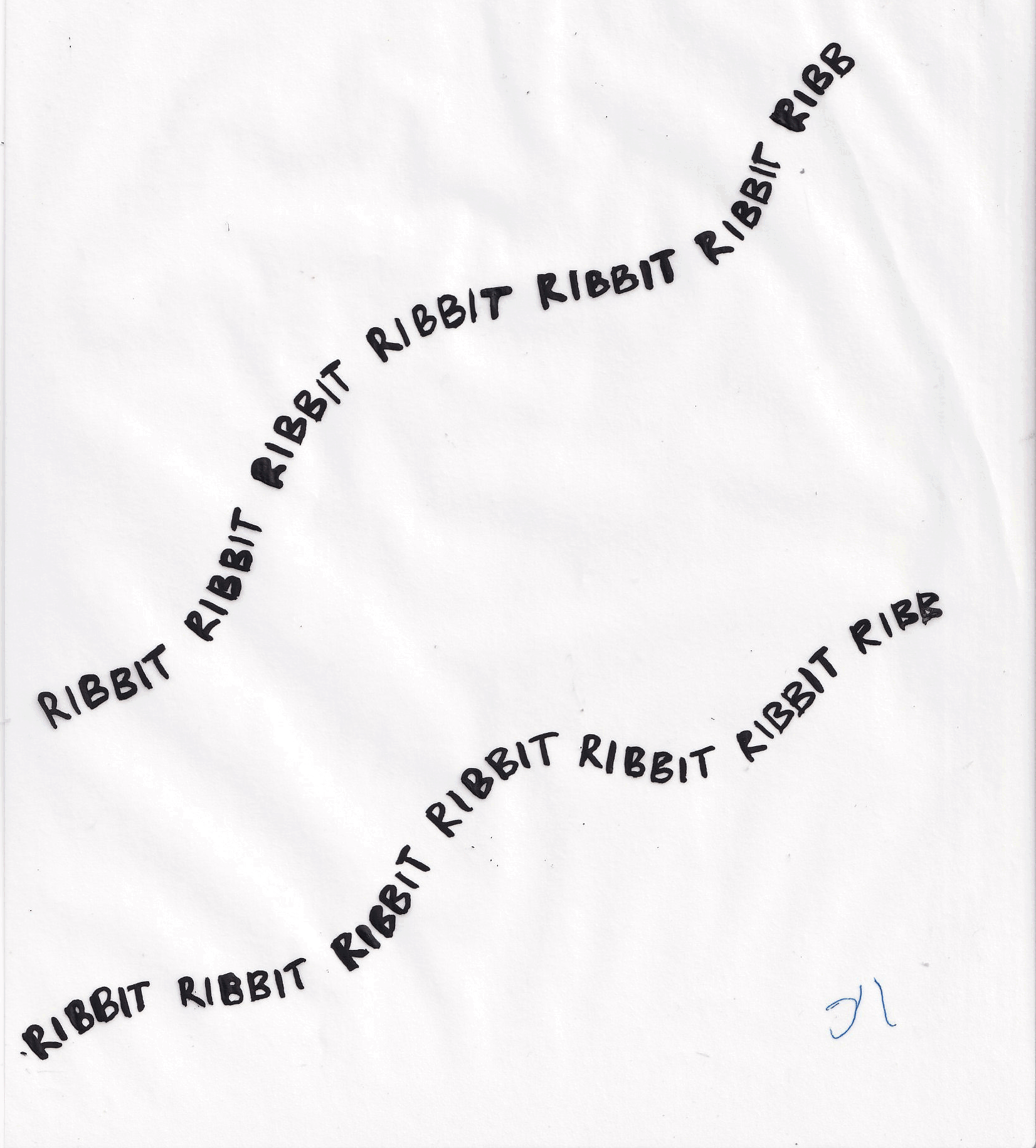
For the second story, focusing on the disappearance of green tree frogs, I wanted to play with paper textures to communicate something being ‘ripped out’ of a landscape in a tactile way. I initially began experimenting with using the transparency of the paper to build up tone, but found that this was very limiting in terms of the range of tone I could achieve. I found that by experimenting with monoprinted textures, I was able to communicate some dryness and tactileness as well as allowing for a more versatile range of tones. In the final illustrations, I limited and muted the colours in a way which allowed for the texture to come through more, and to highlight the presence of the frogs in their voices and presence.
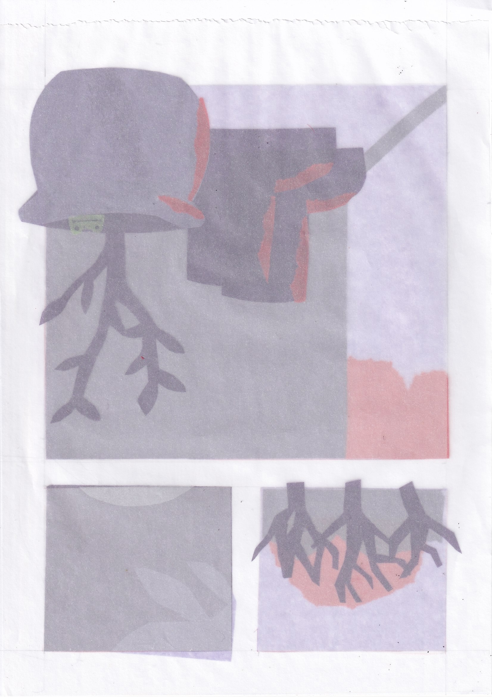

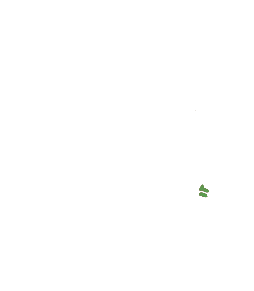
Simplifying the shape of the frog and playing with monoprinted, stencilled textures also allowed me to think about how I could use this to communicate the fading away of the frog using a page turn, and to indicate the passing of time.

The final illustrations were made with layered cut paper, and animated through manipulating layers by hand and then scanning them in frame-by-frame. I wanted to give the animations a hand-generated feeling. More detailed elements such as the moving type and frog outline were done in cel-animated ink. Based on feedback from my tutor and peers, I refined the type to more accurately reflect the sounds of ‘choirs of frogs’ described in the text.
For the endpapers and the title pages of the stories, I chose to draw out the process and the handmade-ness of the way I engaged with these subjects by using the individual frames as design elements.

