Hello! I’m Liesel, a Sydney-based
graphic designer, illustrator
and consultant.
Work
Illustration
About Me
Get in Contact
︎ liesel.schwinghamer@gmail.com
︎ @lieselsc_
︎ Liesel Schwinghamer
︎ User Experience Mapping & Testing
︎ Initial experiment: Eyejack Book
My use of AR carried on from a previous experiment with the app Eyejack, where I used Augmented Reality to explore the features and limitations of a printed book. Inspired by the idea of paratexts, I used AR to reimagine the boundaries of a book’s pages as physical boundaries. I was very interested in how the interaction between the two had the capability to create moments of revealing, intensifying or amplifying experience for audiences that was already captured in a book’s average features. How could I use augmented reality as a tool to learn more about books as interactive storytelling devices? And how could I use it as a metaphor for being on the brink of change?
I was also inspired to explore Augmented Reality as a metaphor device by New Zealand artists Hayden Fowler, particularly his performance piece ‘Together Again’ (2017) which performance and augmented reality to explore contemporary disconnection from the natural world.


︎ Designing stories considering user experience capabilities of AR
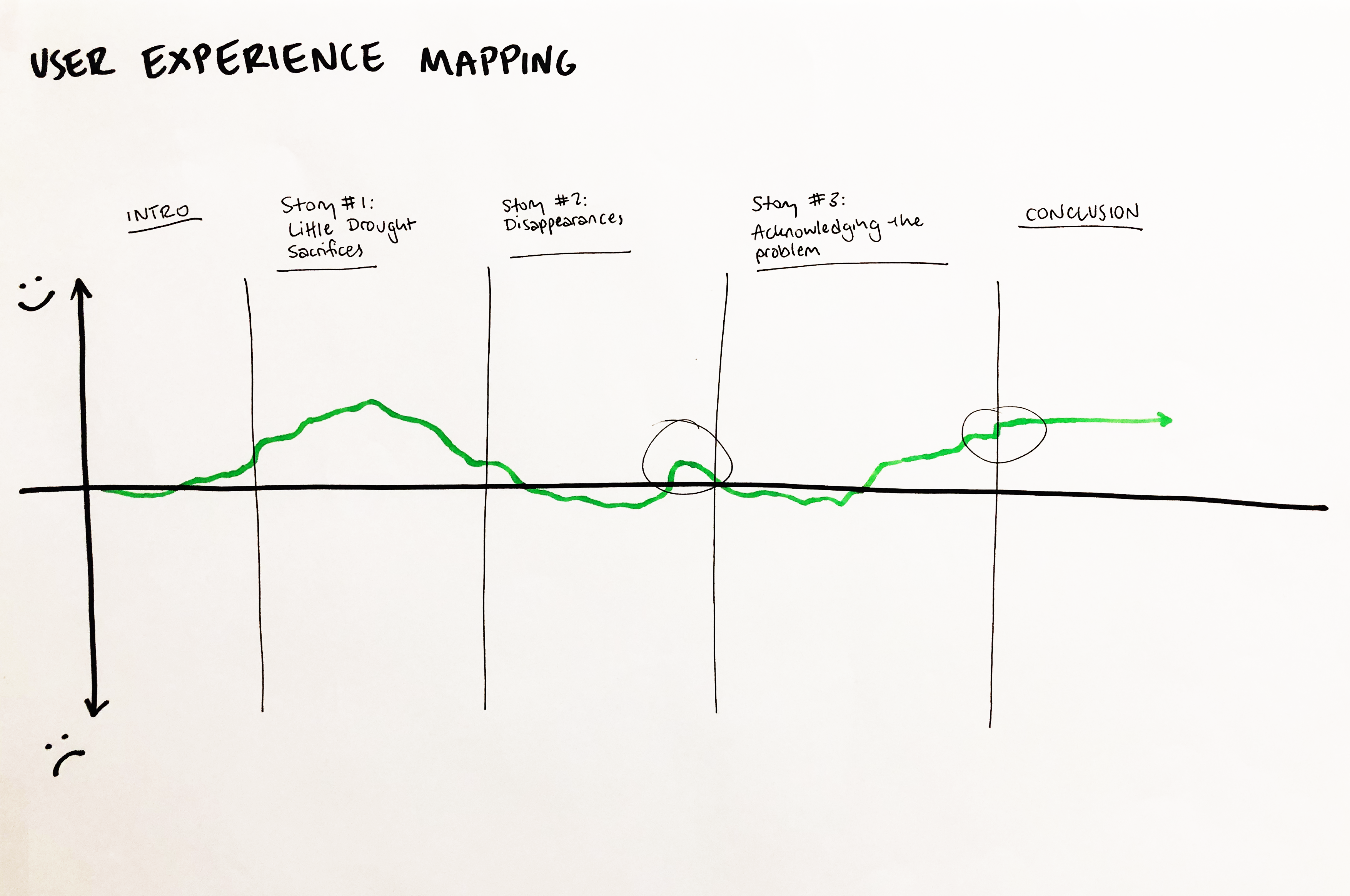
While planning how to visualise the stories I’d extracted from the voicenotes, I had a challenge in how to get my head around designing for stories which weren’t just linear, but included interactive elements. For this reason, I found that simply storyboarding wasn’t enough to plan and construct these stories. Thinking with user experience mapping techniques really helped me to be purposeful with the way I integrated interaction into the book. Ellen Lupton’s book Design is Storytelling (2017) was particularly helpful to me here, particularly her suggestion that every experience could be mapped and understood as an emotional journey. Mapping the experience of my book in this way let me think about where I wanted viewers to take away happiness from the story, and what note I wanted to leave them on. This, in turn, encouraged me to think about other aspects of a book such as repetition or page turn in terms of user experience features. Additionally, the visual systems I began to set up here for led into how I presented my interactive stories for feedback, and then into how I signified where users should expectr AR in the final book.

︎ Presenting drafts of interactive stories for feedback
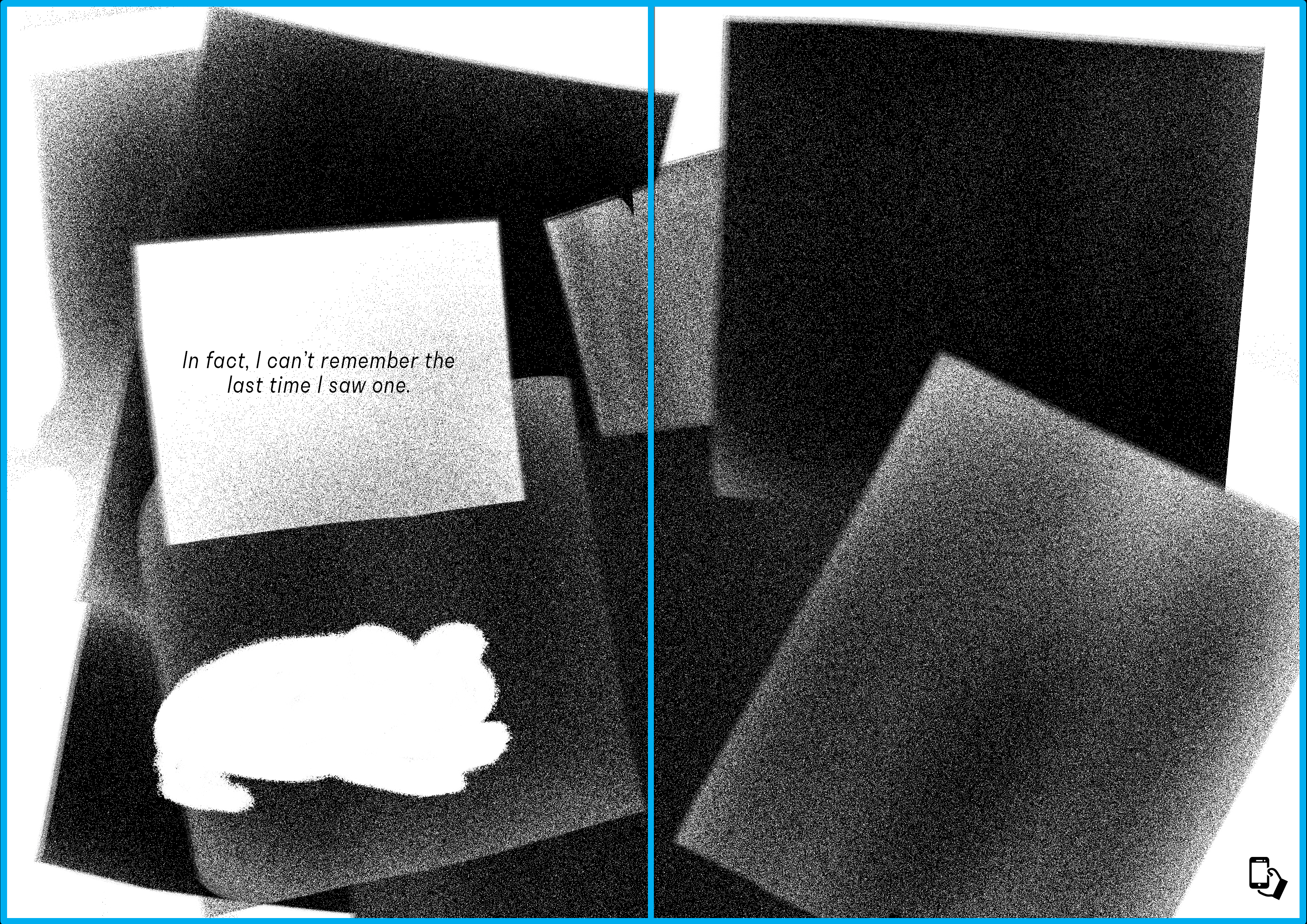
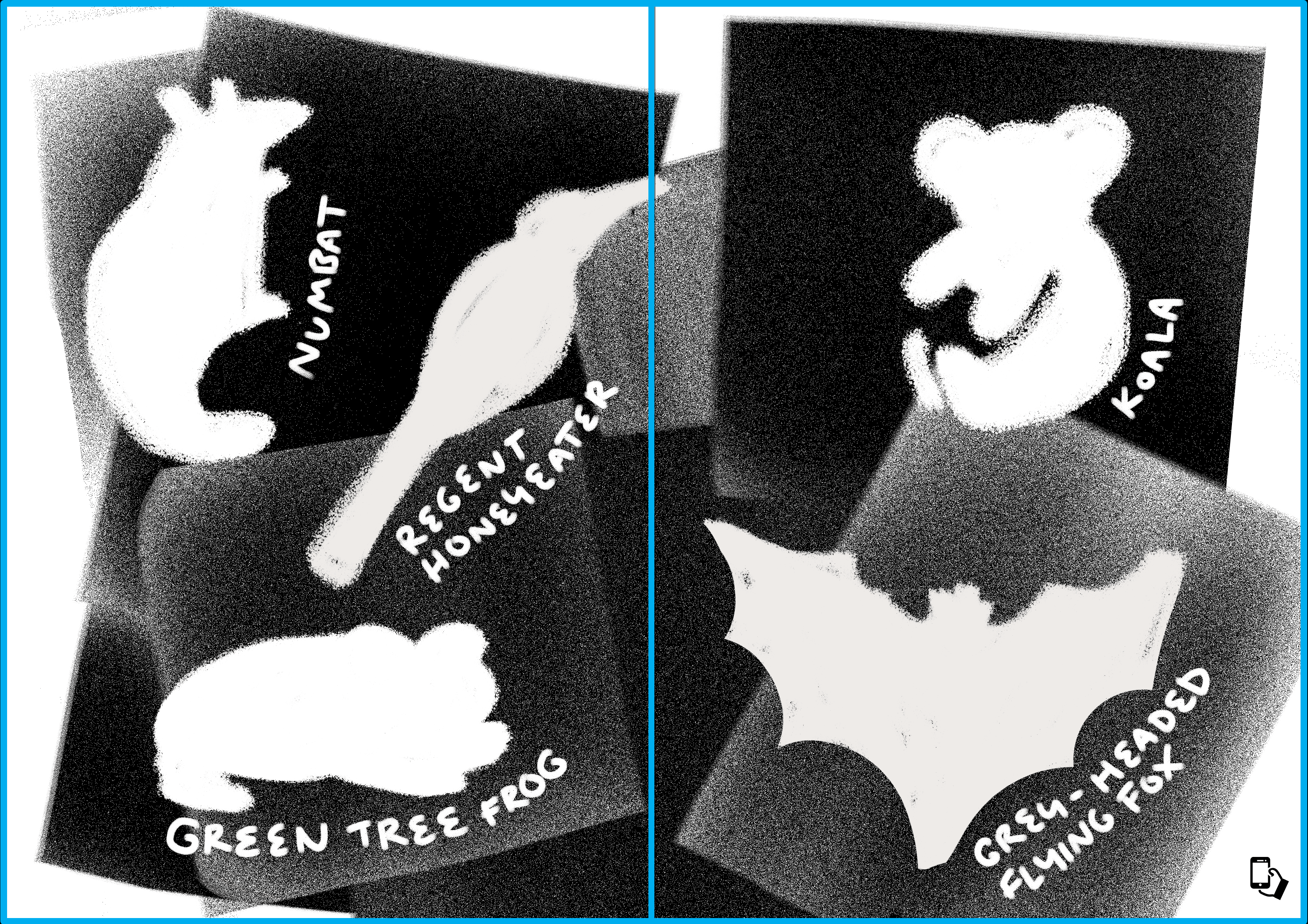
The solution I found was to put the drafts into a Google Slides presentation, which was able to support the looping gif animatics, and then present and read out the stories to participants via Zoom. I explained before beginning that slides with a white background showed the basic view of a reader, while pages with a blue background showed the view through the phone screen.
This system was successful and I was able to get useful feedback from my peers and interviewees which helped to shape my final stories. However, it still had limitations in that some of the people from Tamworth I asked for their feedback didn’t have Zoom, and so for some I needed to go for more low-fi options to share the work by filming my screen. While I was still able to get the feedback I needed, this was an important limitation to note for any future work with creating interactive work for regional communities.
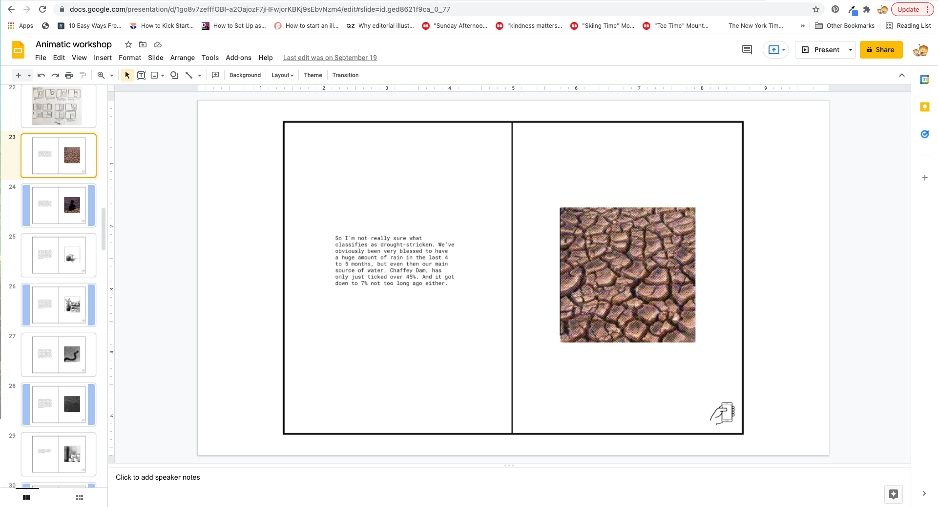 Basic view of static page in Google Slides
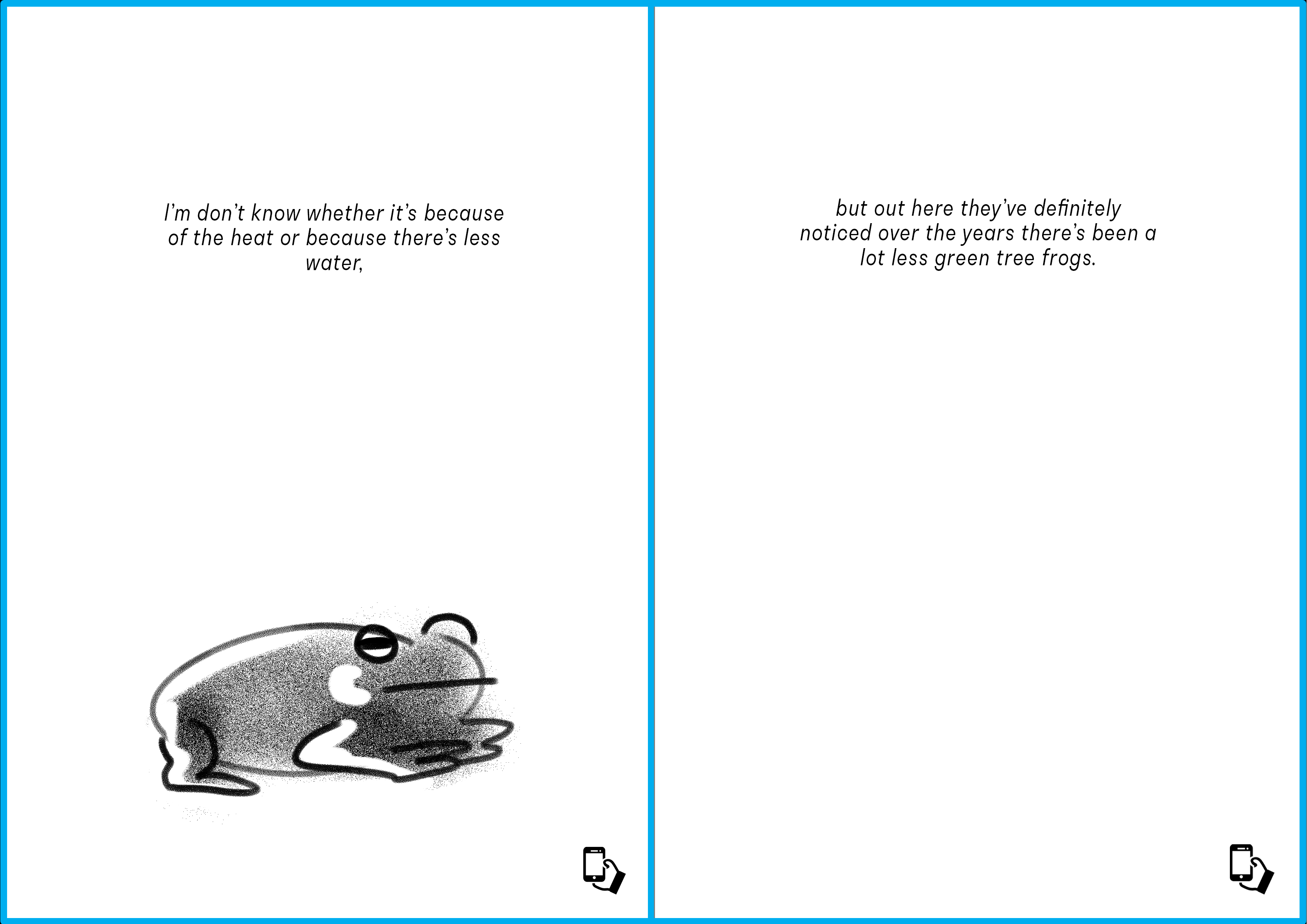
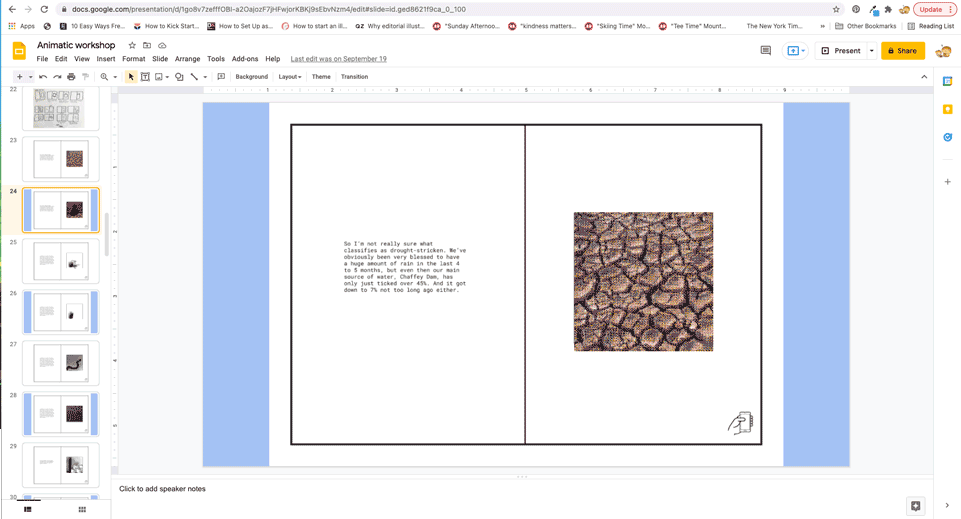 Presentation of animatic as it would be viewed through AR
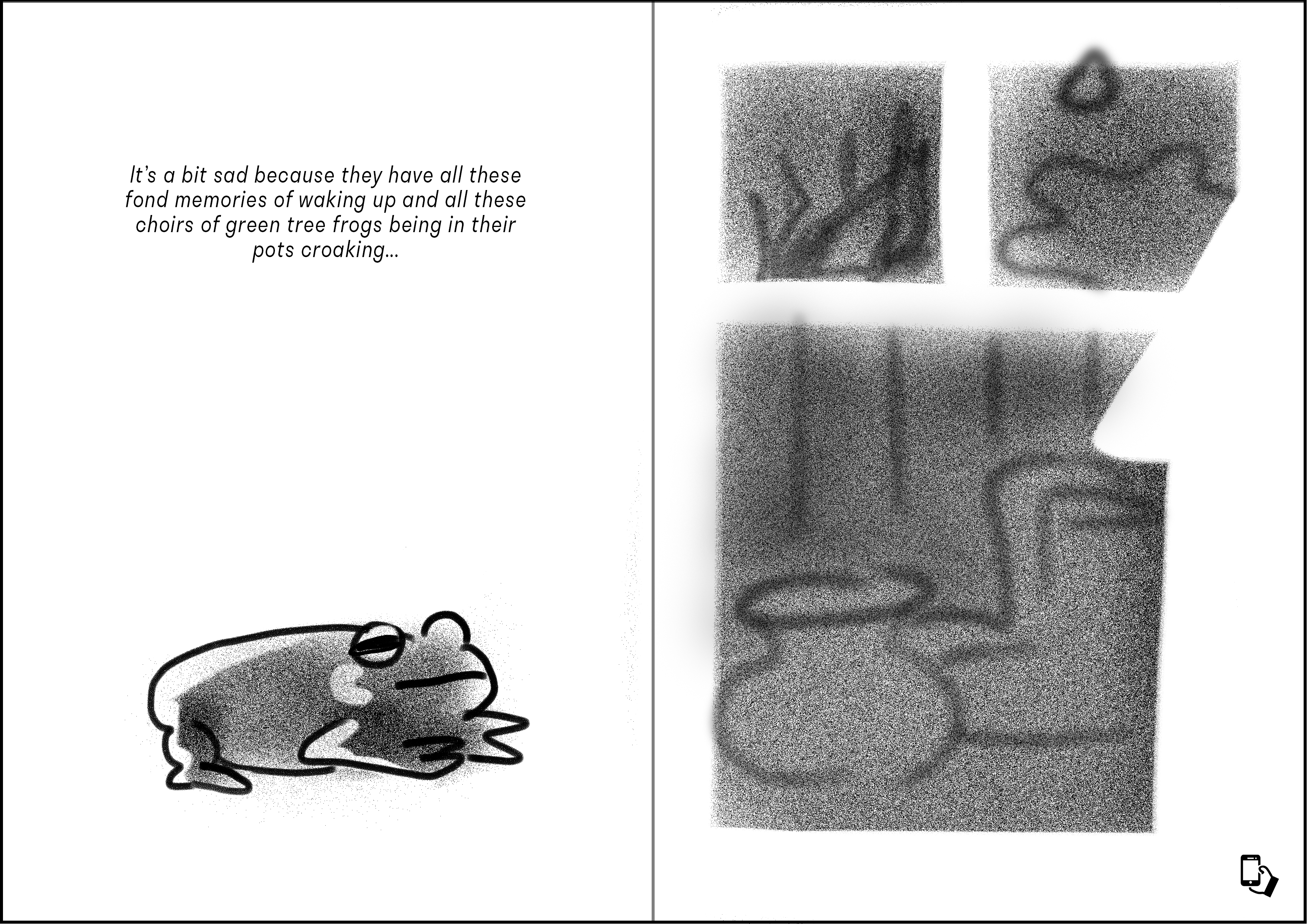
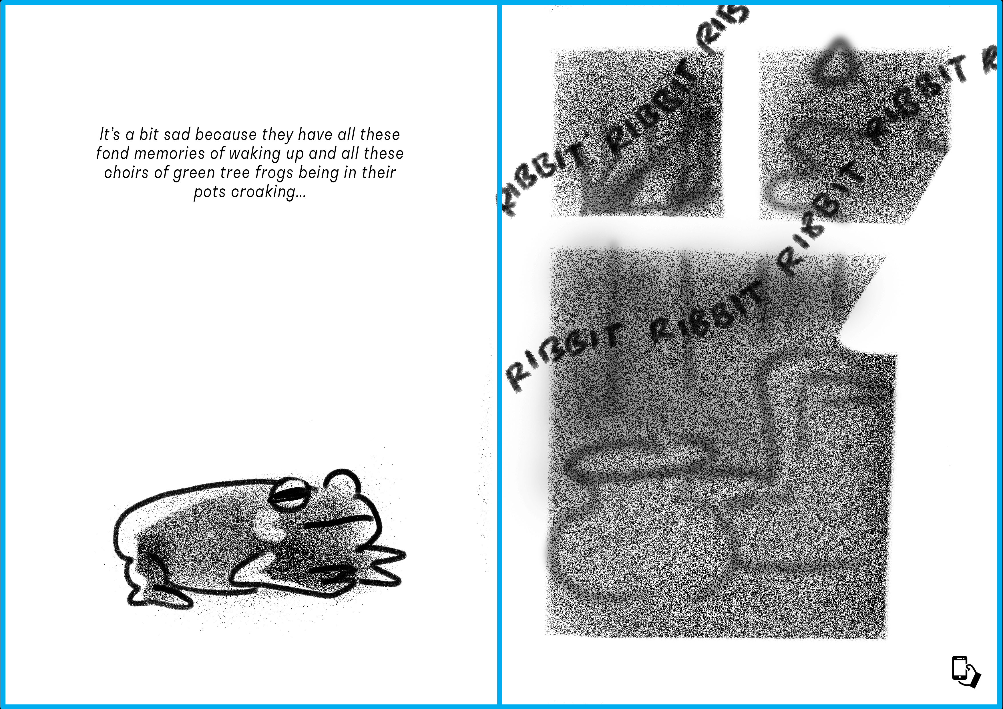
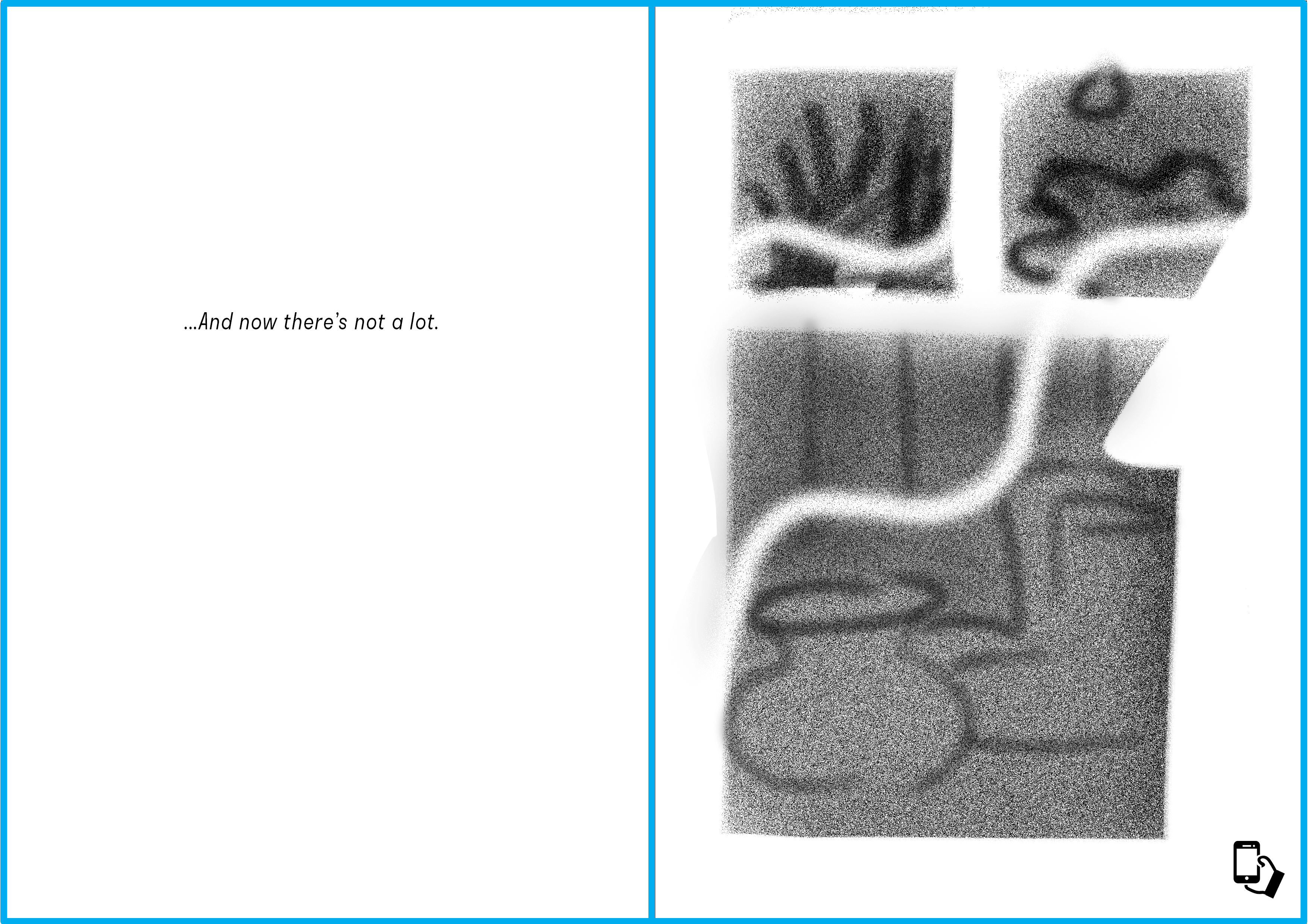
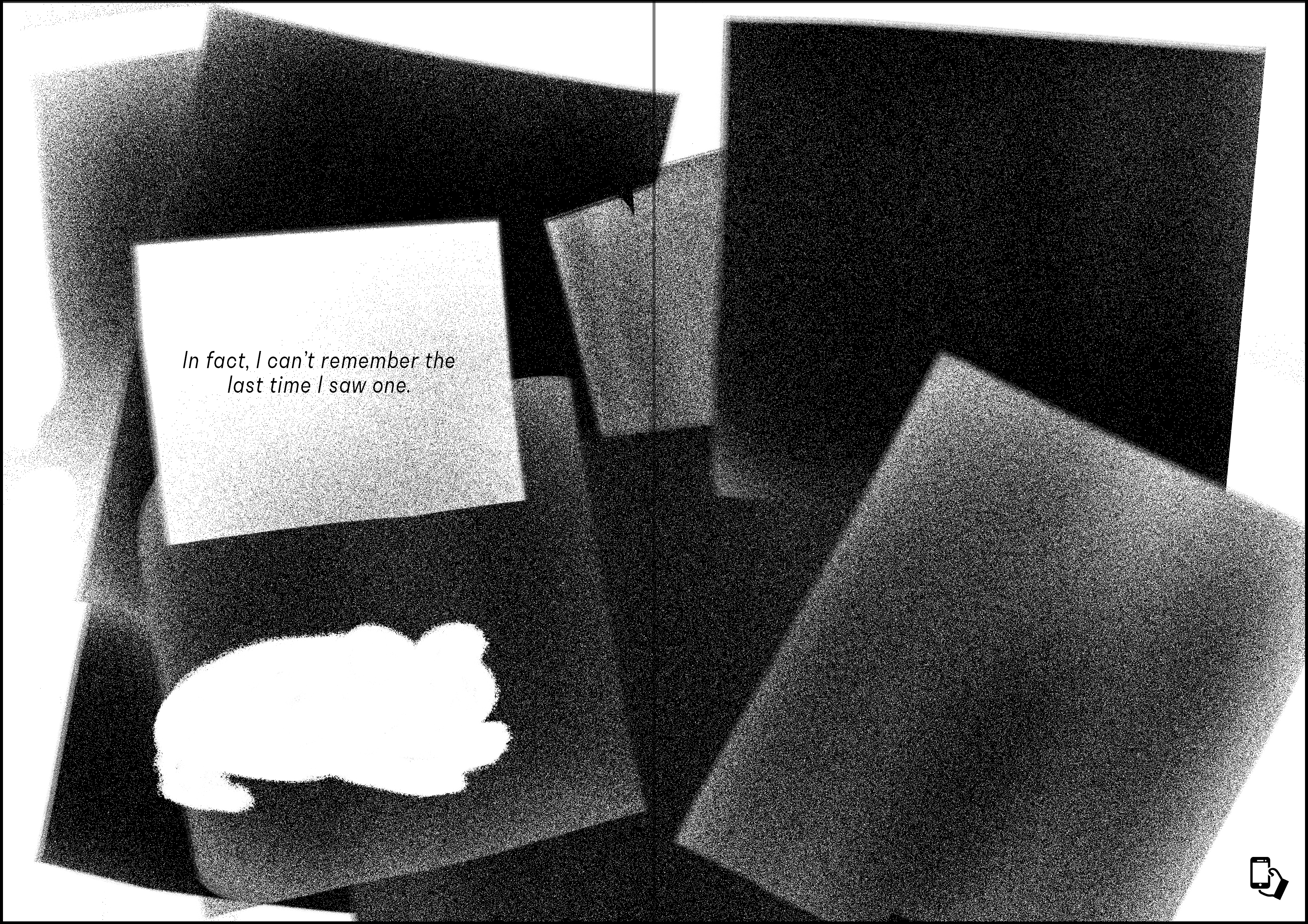
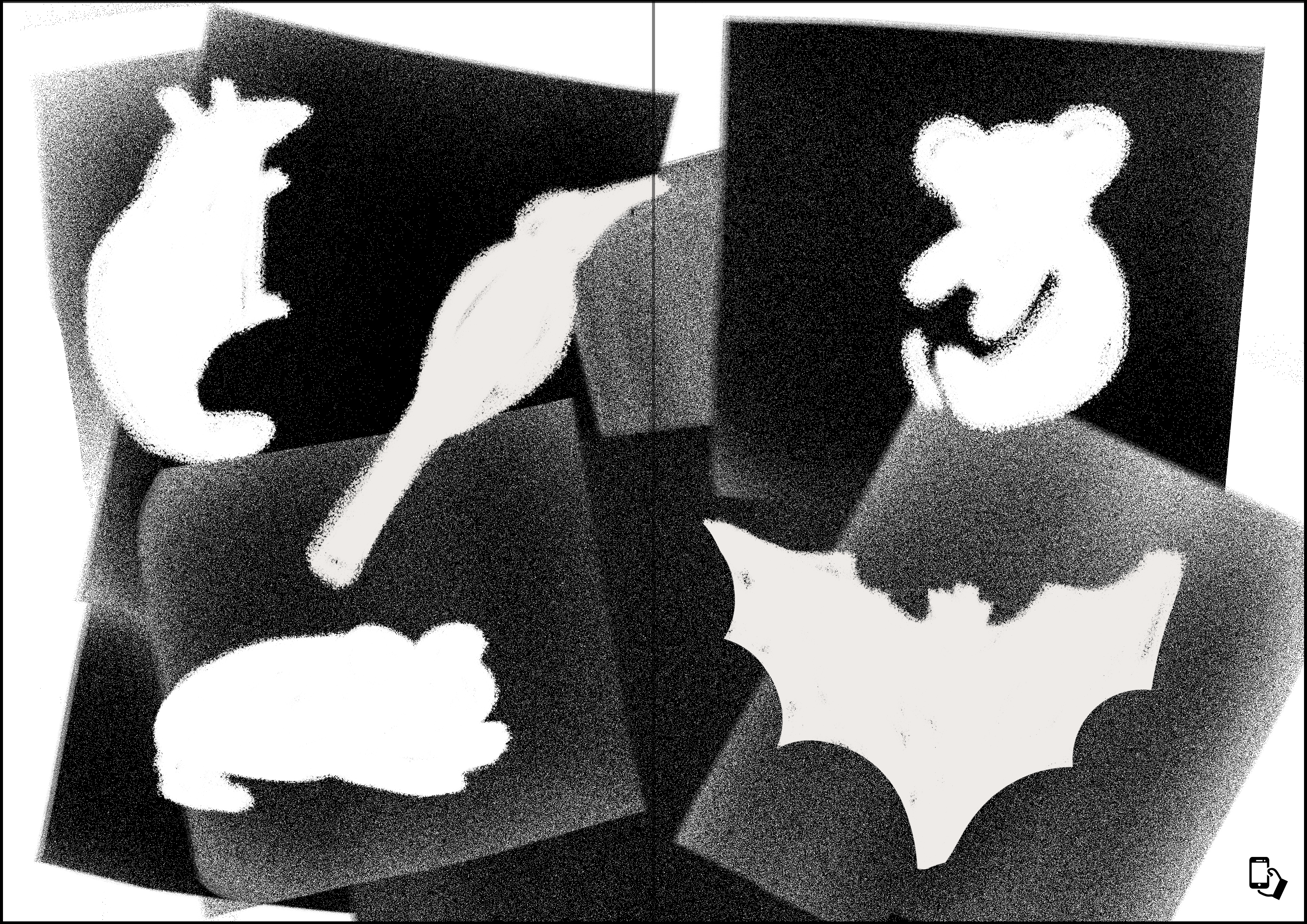
Below is a more detailed breakdown of the animatics for the story about disappearing frogs, as presented using the visual system set up in Google Slides.


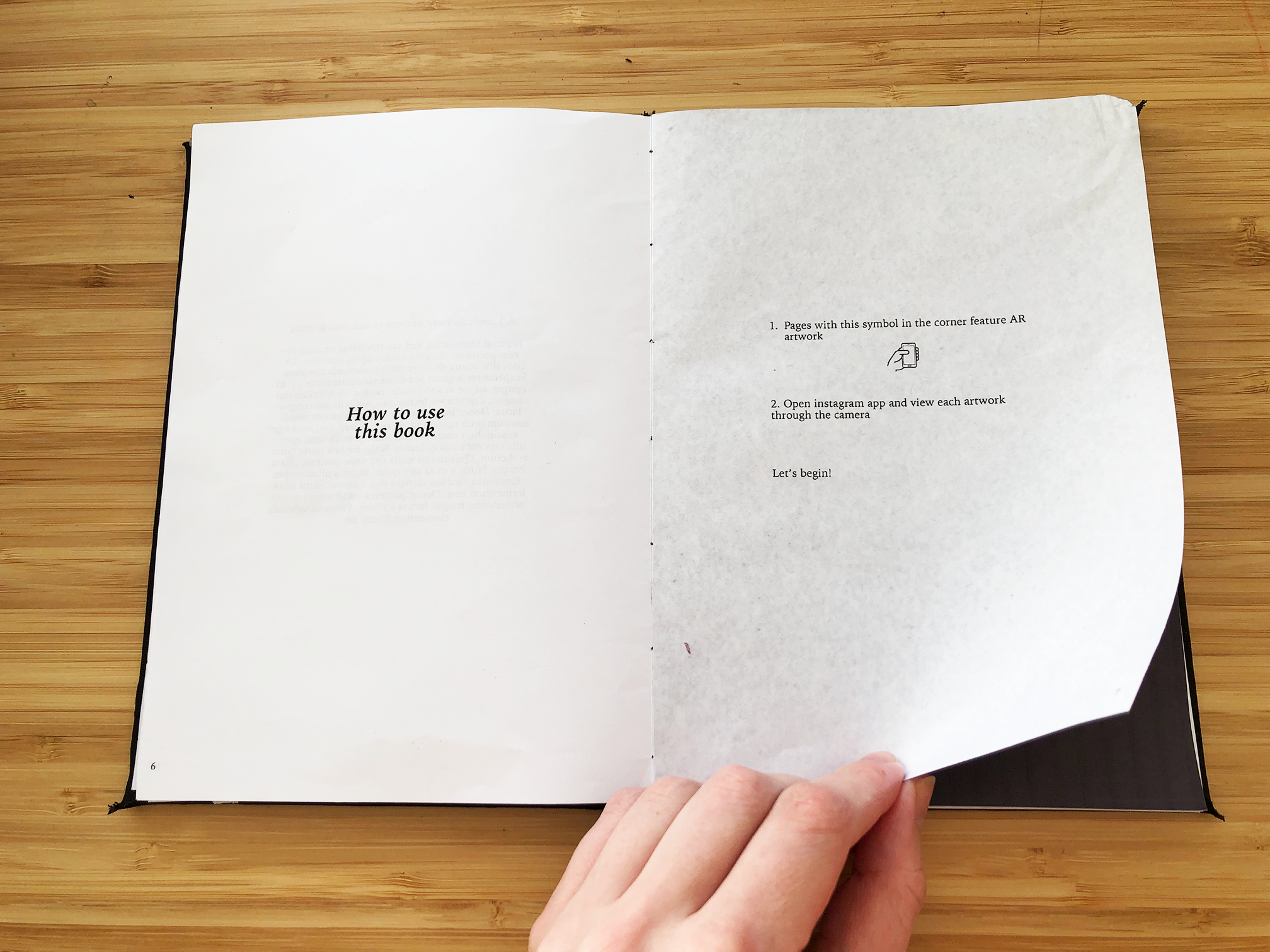
︎ How do you design a book for AR?
The first draft of my publication design was made bearing in mind that to be usable, there was a limit in size, as users wouldn’t want to hold their device too far away from the book. I also chose kettle stitch to bind the book as I knew it could lie flat, thus not disturbing the AR too much. However, as I moved through iterations of the layout and binding, I received feedback that I needed to rethink the layout through the lens of being viewed through a device.


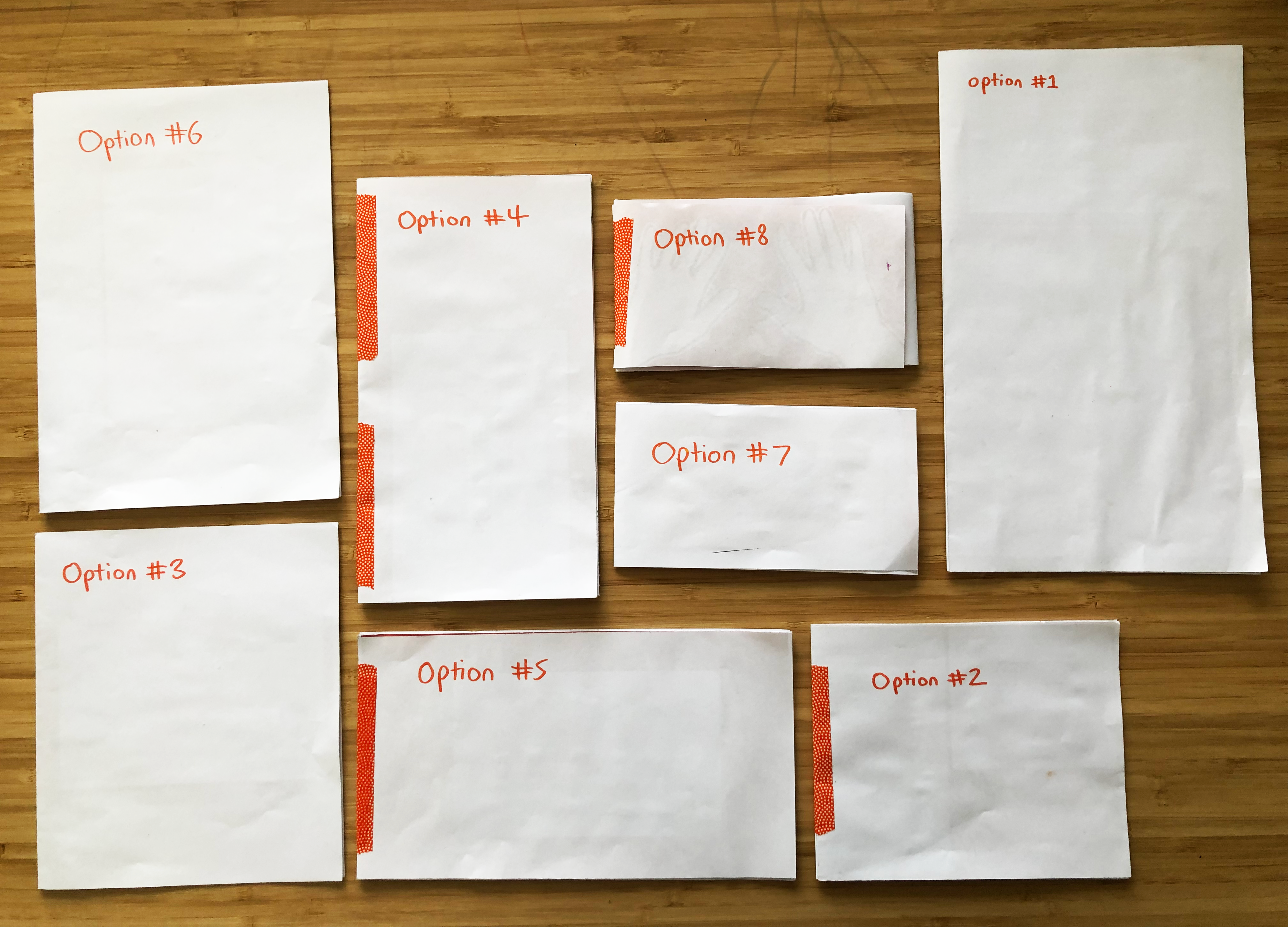
I created a series of simple booklets working with a 16x9 aspect ratio which would roughly encompass a view through a phone screen, either in dimensions or in grid. I set out the same animation and text in each and hooked it up to Eyejack, and then put each through user testing. The insights I got from this were important to my outcome as they revealed how many assumptions I had had about the way people would interact with this object. Important pieces of feedback included:
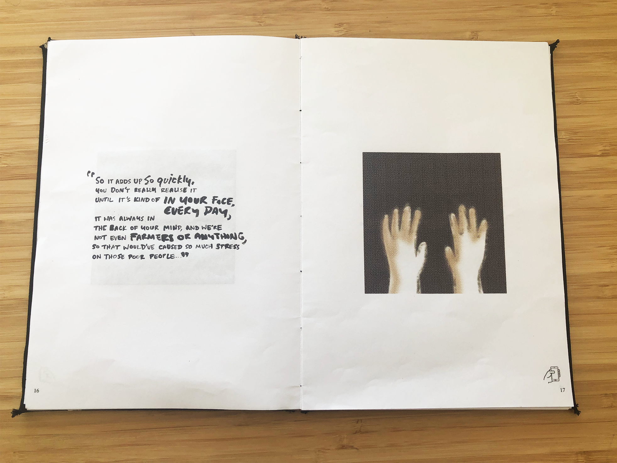
- Users didn’t want to just view the book on a flat surface; they wanted to pick it up and look at it from different angles, in order to explore the AR overlay. For this reason, images over spreads needed to be avoided as the fold distorted them, and margins need to be allowed in order to prevent fingers from overlapping the images and interrupting immersion in the AR overlay.
- I had assumed that users would only want to view the illustrations through AR, but instead they tended to want to look at the entire page, including typography. This lead me to rethink designing illustrations to be viewed through AR into designing spreads to be viewed through AR.
- There was a clash between the users’ desire to hold their phone at profile, which was the most comfortable, and the normal left-to-right reading of a book spread. Comfort to one came at the cost of the other. I decided it was more important to usability to prioritise having a more familiar book form, and indicated that the user should hold the phone in profile through an icon at the bottom of each page.


Based on the insights from these experiments, I developed a final grid which included the following features:
